

One of the more exciting things from yesterday’s Battle Creek Rumble Bees press conference was that they laid out so many details right then and there. The website was up, they announced the GM/Director of Hockey Ops in Adam Stio, the first home game date, and jerseys!
The view from the lone camera at yesterday’s presser didn’t exactly give us the best view of the new jerseys, but lucky for us, Mr. Stio was able to provide us with a detailed look at both the black and yellow jerseys, and let’s just say this: They are LOUD.
Take a look:
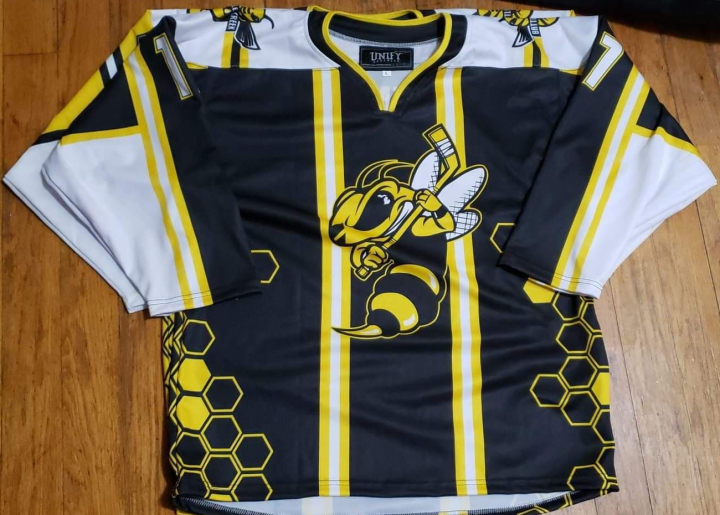
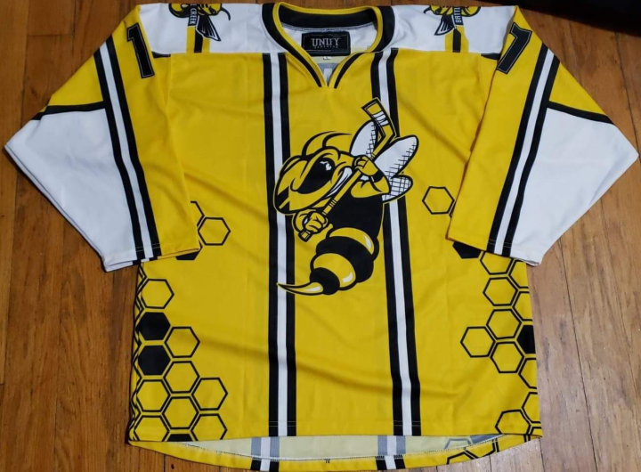
The honeycomb pattern up the sides, the stripes on the chest and sleeves, contrasting shoulders, and of course that hotly discussed logo front and center on each jersey. Needless to say, these are going to get noticed and get people talking.
The reviews in the BLH chat were mixed, with some people loving them and how loud they were, and others a little less impressed, not liking the stripes on the front that make them look like suspenders.
Regardless, they will certainly have one of the most unique looks in FPHL history when they hit the ice this fall.
What do you think? Do you love them or hate them?

Hate them! Too many odd shapes and stripes, and the stripes on the front of the jersey do look like suspenders. I’m all for original designs but too many teams go completely overboard and this is a good example of this.
LikeLike
I don’t hate them or like them I can live with them. the honeycomb does look good, but the stripes look like its a soccer jersey not a hockey jersey.
but we will see what the players will say when they see both jerseys
LikeLike
Modern day Cincinnati Stingers jerseys. I like them.
LikeLike